The FieldValue tag displays field values from a database record. These controls can display data as well as input data.
The GEN:FieldValue tag places the value of a database field on the page. Use the Property Sheet to specify the actual field whose value is to be displayed.
|
|
The FieldValue tag displays field values from a database record. These controls can display data as well as input data. |
The FieldValue tag can be used either by itself, within a Record tag or within a Table tag. If the FieldValue tag is used by itself, the page will incorporate each FieldValue within an ASP.NET control tag for a record. To optimize the application, you can enclose the FieldValue code generation tag within a Record code generation tag. Enclosing the FieldValue tag within a Record tag is faster because the FieldValue tags can inherit properties from the Record tag’s properties.
The FieldValue code generation tag creates ASP.NET control tags in the ASPX or ASCX file. The specific ASP.NET control tags created depend on the field value type (e.g., text, image). The primary ASP.NET control tag may be followed by some validator control tags (e.g., RequiredFieldValidator).
<GEN:FieldValue Name=“FirstName”/>
FieldValue controls have many properties:
[Application Generation] properties (Iron Speed Designer)
[Events] properties (Iron Speed Designer)
[FCKeditor] properties (Iron Speed Designer
[Formatting] properties (Iron Speed Designer)
[Images] properties (Iron Speed Designer)
[Pop Ups] properties (Iron Speed Designer)
[Validators] properties (Iron Speed Designer)
See ASP.NET Control Properties for details.
These properties control specific types of controls created by Iron Speed Designer.
|
Property |
Description |
||||||||||
|
Checked value CheckedValue |
The value saved into the database when a selected check box field is saved. “Checked value” is generally set to ‘Yes’. While “Checked value” can be set to anything, typical values are True, T, Yes, and 1.
|
||||||||||
|
Control type |
The type of control to display. See FieldValue Control Type Options for details. |
||||||||||
|
Database field Field |
The database field to be displayed in the format: <TABLE>.<FIELD> See Database Field Options for details.
|
||||||||||
|
Date selector type DateSelectorType |
The type of calendar date selector control displayed in date fields. A Date Selector control presents a calendar-like interface that lets application users select date values.
The calendar’s date format is determined by the “culture” attribute in your application’s Web.config file, e.g.: <globalization fileEncoding="utf-8" requestEncoding="utf-8" responseEncoding="utf-8" culture="en-US" . . . You can set the culture attribute on the Languages step in the Application Wizard.
|
||||||||||
|
Editor type RichTextEditorType |
Specifies which text editor control to use.
|
||||||||||
|
File name field FilenameField |
The companion database field containing the file name of an uploaded or downloaded file. Used for the File Download and FileUpload controls, this companion database field must be in the same table as the field containing the actual file contents. File Upload For File Upload, the file name of the uploaded file is stored in this field. The File Upload control displays a separate text box data entry field for entering a file name to upload into the database. File Download For File Download, the value of this field displays a file download link that when clicked opens (downloads) the file. The File Download control displays a clickable link to open (download) the file.
|
||||||||||
|
Increment / decrement buttons EnableIncrementDecrementButtons |
Specifies whether increment and decrement buttons are displayed.
Increment and decrement buttons are enabled by default if this property is not present. You must explicitely set this property to False if you do not want increment and decement buttons for the designated field. You can globally disable the generation of increment and decrement buttons in the Application Generation Options dialog (Tools, Application Generation Options...). If disabled globally in the Application Generation Options dialog, no increment and decrement buttons will be created anywhere in your application regardless of the “Encrement / decrement buttons” property setting for any individual FieldValue tag.
|
||||||||||
|
Large list selector threshold MinListItems |
The minimum number of items required before the large list selector control is automatically displayed along side the FieldValue component. “Large list selector threshold” applies only when the FieldValue control’s “Control type” property is Dropdown List. The Large List Selector is available for foreign key fields used for data entry. For example, you can display a large list selector if your table has a Category ID field that references a separate “Categories” lookup table. Large list selectors are not available on fields that do not have a foreign key. Large list selectors are available only for data entry fields; they are not available for filters. Note: Large list selectors are available only for data entry fields; they are not available for filters. “Large list selector threshold” can be used in conjunction with “Maximum generated items” to construct various scenarios. For example, you can set “Maximum generated items” to 500 and “Large list selector threshold” to 100. In this case, the dropdown list will contain upto 500 items but the large list selector’s “More” link will appear next to the control once the 100 item threshold is reached.
|
||||||||||
|
Maximum generated items MaxGeneratedItems |
The maximum number of database query values automatically populated in the control. This applies to list-style controls, such as dropdown lists and list boxes. The default value used by Iron Speed Designer is 500 entries. However, you can change this threshold to any value desired on a control-by-control basis with “Maximum generated items”. Note: If the number of entries at run-time exceeds the value of the “Large list selector threshold” property, a More link will be placed next to the field that, when clicked, displays the Large List Selector. If the “Large list selector threshold” is not specified, then “Maximum generated items” is used as the Large List Selector threshold. If you wish to disable the Large List Selector for a particular control, set “Large list selector threshold” to a very large value.
|
||||||||||
|
Security RequiredRoles |
Any security roles configured for an individual field. Individual roles are separated by a semi-colon (‘;’) and are wrapped in tags corresponding to the role management type, e.g.: <SP>/ | TestGroup1</SP><WUG>Ironspeed/Admin;Ironspeed/Engeniiring</WUG>
|
||||||||||
|
Treat other values as checked TreatOtherValuesAsChecked |
Specifies whether a check box field is displayed as selected when other values are encountered in the database. Check box fields can be displayed as either selected (checked) or unselected (unchecked). The “Checked value” and “Unchecked value” properties designate the database values that signify whether the check box should be selected. These are typically values such as ‘True’ and ‘False’ or ‘1’ and ‘0’. In some cases, the underlying database field may have values other than those specified by the “Checked value” and “Unchecked value” properties, e.g., the values may be ‘True’, ‘False’, and ‘Not Sure’.
If a hypothetical database column has a value of ‘Not Sure’, then the check box would be shown as checked if the “Treat other values as checked” property is set to ‘True’. The check box would be shown as unchecked if the “Treat other values as checked” property is set to ‘False.’
|
||||||||||
|
Unchecked value UncheckedValue |
Specifies the value saved into the database when an unselected check box field is saved. “Unchecked value” is generally set to ‘No’. While “Unchecked value” can be set to anything, typical values are False, F, No, and 0.
|
|
Property |
Description |
||
|
OnClick |
JavaScript executed when the control is clicked or selected.
|
||
|
OnKeyPress |
JavaScript executed when a key is pressed.
|
These properties control the behavior of the FCKeditor rich text editor control.
|
Property |
Description |
||||||||
|
Display tool bar RichTextEditorShowToolbar |
Specifies whether editor’s menu toolbar should be shown when the page is opened for editing.
|
||||||||
|
Editor height RichTextEditorHeight |
The height of the editor control window, in pixels.
|
||||||||
|
Editor width RichTextEditorWidth |
The width of the editor control window, in pixels.
|
|
Property |
Description |
||||||||
|
Allow wrapping AllowWrapping |
Specifies whether displayed text can be wrapped.
|
||||||||
|
Display format DataFormat |
Specifies a field’s display format, typically for numbers and dates. It also specifies the type of text editor used for general text fields. Other special formats apply:
|
||||||||
|
Display style |
|
||||||||
|
Display when contains value TextFormat |
The formatted text displayed when field contains a value. See TextFormat property for details.
|
||||||||
|
Display when NULL NullValueText |
The text to be displayed or inserted into the database if the underlying database field has a “null” value (no value). This is typically set to ‘ ’
|
||||||||
|
HTML encode value HTMLEncodeValue |
Specifies whether to render HTML tags when displaying text. If a field contains HTML code, you can configure the field to render (display) the HTML rather than display ‘raw’ unrendered text.
|
||||||||
|
HTML encode white space HtmlEncodeWhiteSpace |
Specifies whether to HTML encode white space, limiting word-wrapping.
“HTML encode white space” can be combined with the “Allow wrapping” property to achieve various effects. For example, “HTML encode white space = True” and “Allow wrapping = False” respects the white space, carriage return and line feed characters in the HTML, preserving white space; e.g., if you have 10 contiguous spaces, 10 spaces will be output in the field.
|
||||||||
|
Maximum display length FieldMaxLength |
The maximum number of characters displayed on for a text field, limiting the display of long ‘note’ fields in order to conserve screen real estate. Text display limited for mobile pages To reduce the bandwidth required for mobile Show Record pages, text strings longer than 32K are automatically truncated and appended with an ellipses ( “…”). here is no truncation on mobile Edit Record and Add Record pages. Use with “Pop ups” property “Maximum display length” may be used in conjunction with the “Pop ups” property to display a limited amount of text on the web page and complete text in the pop-up. “Maximum display length” also governs the number of characters displayed in PDF Reports created by Iron Speed Designer (PDF Report). Any positive integer may be specified; the lowest permitted value is 1. Several special values are permitted:
The default value is the “Default”. If any invalid value is specified (e.g., 0 or negative number), then all characters in the field are displayed on the web page. Field contents are truncated and HTML tags do not render properly The contents of a rich text field will be truncated if “Maximum display length” is less than the length of the contents in the field. If the contents of a rich text field are truncated, various HTML tags may be displayed rather than rendered as HTML. To “remove” the HTML tags from displaying, increase “Maximum display length” to exceed the length of the contents stored in the field or the length of the database field itself.
|
|
Property |
Description |
||||||||
|
Display threshold PopupThreshold |
The minimum number of characters before an Ajax-enabled text pop-up can be displayed. The text pop-up will be displayed if the number of characters in the individual database field exceeds “Display threshold”. “Display threshold” is used in conjunction with the “Pop ups” property. The default value is the “default” string which represents the default value, typically 100 characters. Any positive integer may be specified. A text pop-up is always displayed if any invalid value is specified (e.g., characters or negative numbers).
|
||||||||
|
Pop ups PopupDisplay |
Enables Ajax-based text and image pop-ups for the field.
Text pop-ups Text pop-ups are displayed if the underlying database field type is a string or character field. The “Display threshold” property specifies when text pop-ups will be displayed. If the field’s Validation Type is Password, then no pop-up is displayed. Image pop-ups Image pop-ups are displayed only if the Control Type is ‘Image’. If the underlying database field type is a string, no image scaling will occur on the underlying web page because the field is assumed to contain a URL and not the binary contents of an image. However, the pop-up will be displayed. Browser requirements Text and image pop-ups require Internet Explorer 7 or later. See Browser requirements for text and image pop-ups for details.
|
||||||||
|
Window height Window width PopupWindowWidth |
The pop-up window width and height, in pixels. Any positive integer value may be specified. PopupWindowWidth and PopupWindowHeight are used in conjunction with the “Pop ups” property. The default PopupWindowHeight value is 200 pixels. The default PopupWindowWidth value is 300 pixels. If PopupWindowWidth and PopupWindowHeight are not present, then their default values are used.
|
||||||||
|
Window persist PopupWindowPersist |
Specifies whether a pop-up window should persist until the mouse is moved. PopupWindowPersist is used in conjunction with the “Pop ups” property.
If PopupWindowPersist is not specified, then ‘False’ is assumed.
|
||||||||
|
Window scroll bars PopupWindowScrollBar |
Enables scroll bars in a pop-up. PopupWindowScrollBar is used in conjunction with the “Pop ups” property.
If PopupWindowScrollBar is not present, the default value ‘True’ is assumed.
|
||||||||
|
Window title PopupWindowTitle |
The title for the pop-up window. PopupWindowTitle is used in conjunction with the “Pop ups” property. Valid input can be any text. The default value is: %ISD_DEFAULT%
If PopupWindowTitle is not present, then no title will be displayed.
|
|
Property |
Description |
||||||||
|
Display |
Specifies whether the space for the validation text and error message is pre-reserved or allocated dynamically at run-time.
Example: OrderDateRequiredFieldValidator:Display
|
||||||||
|
Initial value |
Initial watermark text displayed in the control, e.g., “Enter Title here”. The watermark is not a real permitted value; it is a temporary value. The required validator treats this value as if the user did not enter anything in the text box. “Initial value” also specifies a value for the ‘NO-SELECTION’ entry for dropdown lists. The “Initial value” property applies only when the “Required” property is set to ‘True’. Upon saving, the selected value is compared to the initial value, and if they are the same, an error is displayed to the user requesting they select a value.
|
||||||||
|
Required Required |
Indicates that the field is required. If selected, an application user must provide a value for the field when using the Add Record or Edit Record pages.
|
||||||||
|
Text |
Message displayed on the web page when an incorrect value is entered. Resource File Key You can also dynamically fetch a text string from your application’s resource file (RESX) at application run-time by specifying a Resource Key. This is useful in multi-language applications that have multiple resource files, one for each language. This permits easy application localization by editing your application’s resource file instead of the application itself. Specify the Resource Key in curly braces, e.g.: {Txt:MyTextString}
|
The TextFormat property may include additional text before or after the database value, any HTML tags such as font, bold or underline, and hyperlinks. The {0} substitution variable may be used in the text to include the database value. {0} is the .NET String.Format method’s formatting specifier, and you may use any format supported by the String.Format method. The substitution variable can be used any number of times in the TextFormat property.
|
Purpose |
Example TextFormat value |
|
Specify a prefix or suffix |
Phone: {0} {0} (fax) |
|
Format values with color, bold and underline |
<font color=“red”><b><u>{0}</u></b></font> |
|
Mailto hyperlink |
<a href='mailto:{0}'>{0}</a> |
|
Hyperlink a database field |
<a href=’{0}’>Click Here</a> <a href=’{0}’>{0}</a> |
When used with long text fields, these properties also must be set to display the text value correctly.
|
Property |
Setting |
|
HTML encode value |
False |
|
Pop ups |
False |
|
Maximum display length |
An integer value greather than the length of the text so that all text including embedded HTML tags is displayed |
|
Display threshold |
A large integer value |
Any combination of text, HTML and the actual database value can be displayed. The following examples illustrate how text, HTML and the database field value can be combined.
|
Display this when field contains a value |
Displays as |
Purpose |
|
{0} |
William |
Displays the database field value. |
|
<font color="red">{0}</font> |
William |
Displays the database field value in red. |
|
<a href="mailto:{0}">{0}</a> |
bill@ironspeed.com |
Displays a ‘mailto’ email link. The field should contain a valid email address. |
|
<a href="{0}">{0}</a> |
www.ironspeed.com |
Displays a clickable URL (hyperlink) from the database. The field should contain a valid URL. |
|
<a href="{0}" target="_blank">{0}</a> |
www.ironspeed.com |
Displays a clickable URL (hyperlink) from the database. The field should contain a valid URL. When clicked, a new browser window is opened with the hyperlinked page. |
|
<a href="http://www.ironspeed.com/kb?q={0}"> |
Search for William |
Displays a clickable URL (hyperlink) as part of a query string. The field should contain a valid URL. |
|
<img src="{0}" /> |
|
Displays an image if the field contains a valid URL. |
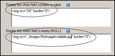
The conditional display feature is frequently used to display ‘not available’ or ‘image not found’ when fields are emplty. The example below illustrates how an image can be displayed from the database field containing a URL. If the field is empty, a ‘no image available’ default image is displayed instead.
Step 1: In the Property Sheet, set the Control Type property to ‘Literal’. Conditional display is available for the Label and Literal control types.
Step 2: Use an <img> tag to display an image using the URL stored in the database field.
Step 3: Use an <img> tag to display a default ‘no image available’ image when the database field is empty, i.e., it does not contain a URL.
The conditional display feature can be used to display hyperlinked (clickable) URLs if your database field contains a URL.
Step 1: In the Property Sheet, set the Control Type property to ‘Literal’ to enable the conditional display feature.
Step 2: Use an <a href> tag to display a clickable URL using the URL stored in the database field.
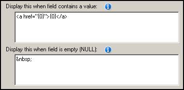
Step 3: Build and run your application.
If the database field only contains a page or file name and not a fully qualified URL, the <a href> tag can be expanded to add a prefix to the location containing the file, e.g.:
<a href="http://www.ironspeed.com/{0}">{0}</a>
You can open the hyperlinked page in a new browser window by providing a “target” attribute, e.g.:
<a href="{0}" target="_blank">{0}</a>
When displaying fields as ‘rich text’ it is common for records with smaller amounts of text to be displayed as rich text and for records with larger amounts text to be truncated and displayed in the browser font because there isn’t sufficient room to display them as rich text. This can lead to a situation where the fonts in certain table cells differ markedly. Most likely your field is set to show text as Default, allowing the Application Generation Options to decide how to display the text. If set to display text as ‘Rich text’ and the threshold is low enough that this field qualifies to use rich text, then any cell in this column where text fits completely will be shown as a rich text; any cell where the text length exceeds the cell width will be truncated and displayed in the default browser font.
To show all text using the same font, you can do one of the following:
Increase the cell size in the Application Generation Options to fit the entire text into the cell. While this will enlarge many table rows, all text will be displayed as rich text.
Set the Application Generation Options to show text as 'HTML source' and rebuild the application. The text will be displayed as regular text and not as rich text. However, embedded HTML tags in the rich text will be displayed as raw HTML tags and not rendered.
Set the particular field to show as ‘HTML source’ in the Properties for the field. The text will be displayed as regular text and not as rich text.
Increase the size of the “Maximum display length” property to exceed the length of the contents stored in the field or the length of the database field itself. See FieldValue Tag for details.
Don't use the rich text editor option (FCKEditor) to enter text. Use the ASP.NET multi-line text control instead. You can choose between the two either globally via the Application Generation Options dialog or on a field-by-field basis via the Property Sheet. Of course, with this option you won't have any HTML text formatting either.
Write a code customization that strips out the embedded HTML for display purposes. All text, regardless of length will be displayed in the default browser font.
Microsoft IE 7 and later is required to display text and image pop-ups. In IE 6, pop-ups appear with a white box surrounding it because IE 6 does not support transparent PNG images used to implement the pop-up window.
You can enable transparency in IE 6 by uncommenting the “detailRollover” styles in your application’s BaseStyles.css style sheet file (located in the Styles folder) and in your application’s ApplicationWebForm.js file (located in your application folder). When you enable these styles, ‘filter’ warning messages will appear when opening your application in Microsoft Visual Studio. However, these warning messages are innocuous and have no effect.
Your application may contain these properties that are no longer used and are obsolete. In general, most obsolete properties are benign and will not affect your application’s code or run-time operation.
|
Property |
Description |
|||||||
|
<Tag Name>FvDsHyperLink:Visible |
The calendar date selector control is enabled by default if this property is not present. Example: OrderDateFvDsHyperLink:Visible
|
|
||||||
|
LoadData |
Specifies whether to load the field’s data, overriding any default (initial) value.
Example #1: To set an date updated audit field every time the page is edited, set the date field’s initial value to “DateTime.Now()” and set the LoadData property to ‘False’. Example #2: To initialize a field’s value if no value is present in the database, set the field’s initial value to the value you want, and set the LoadData property to ‘True’. If the value exists in the database, it will be used. If no value is present in the database, the initial value is used.
|
|
||||||
|
Permitted values |
The list of individual items to be displayed. This option is available only if the list is not created from the database. When selecting this option, an extra “empty” item may be displayed in your application at run-time. For example, a radio button with no text may be displayed. This occurs when no default value has been specified for the field. To remove this empty item, click the Global Properties... button to specify one of the options as a default value. |
|
||||||
|
SaveData |
Forces or suppresses saving the field’s data to the database.
The SaveData property defaults to “True” for some controls and to “False” for others. Other controls, such as the Link Button, don’t allow SaveData to be set to True.
|
|
||||||
Code Generation Tags
Code Generation Tag Properties
FieldValue Control Type Options
